Injecting colour
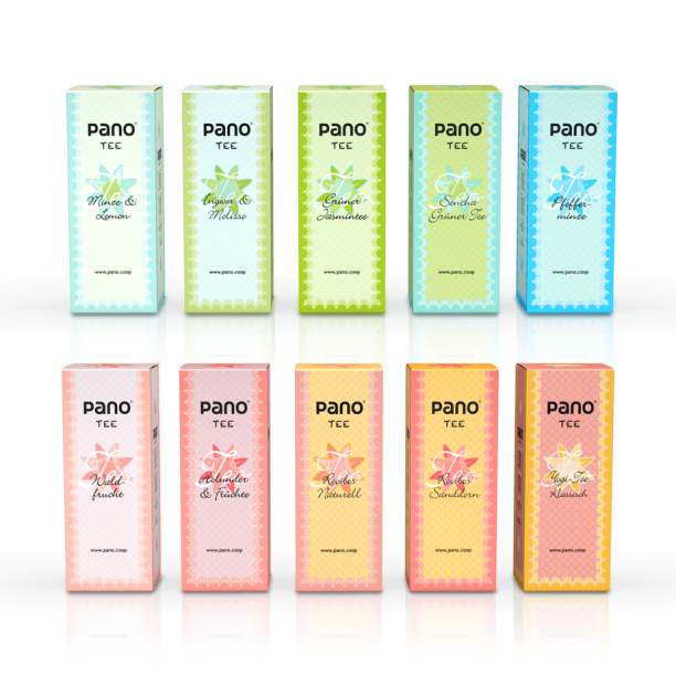
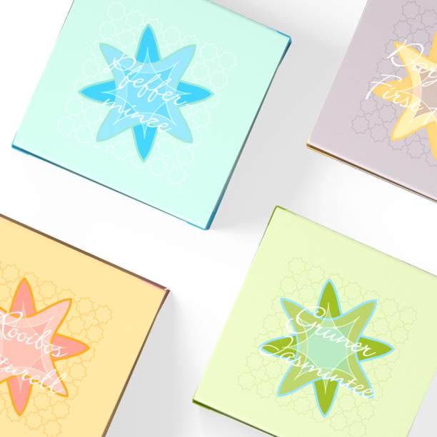
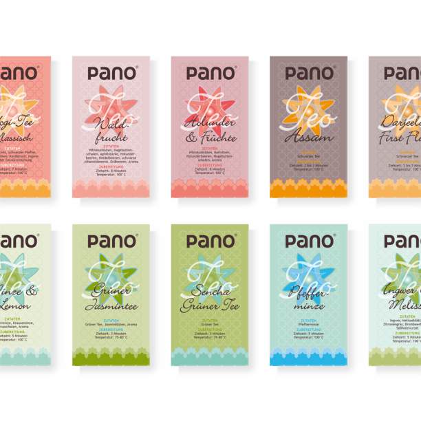
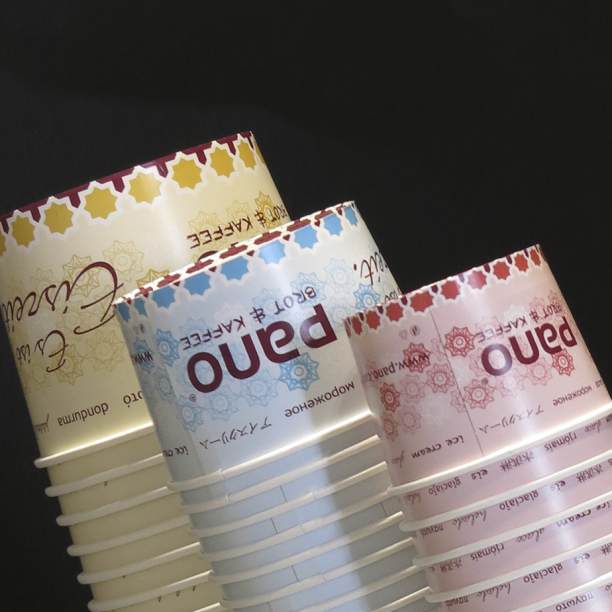
Colours dominate shape and word. The colour codex developed for pano bread & coffee in combination with a specific, variable sample represents the recipes and products in exquisite workmanship quality. The visual appearance is enhanced by an artistically appealing font and a chalk font to match the slate boards in the pano stores. The packaging for the varied range was colour coded, their sampling creatively interpreted according to flavours.


© 2014 - 2023 eisele kuberg design · Produktentwicklung und -gestaltung · fon +49 731 9807555